
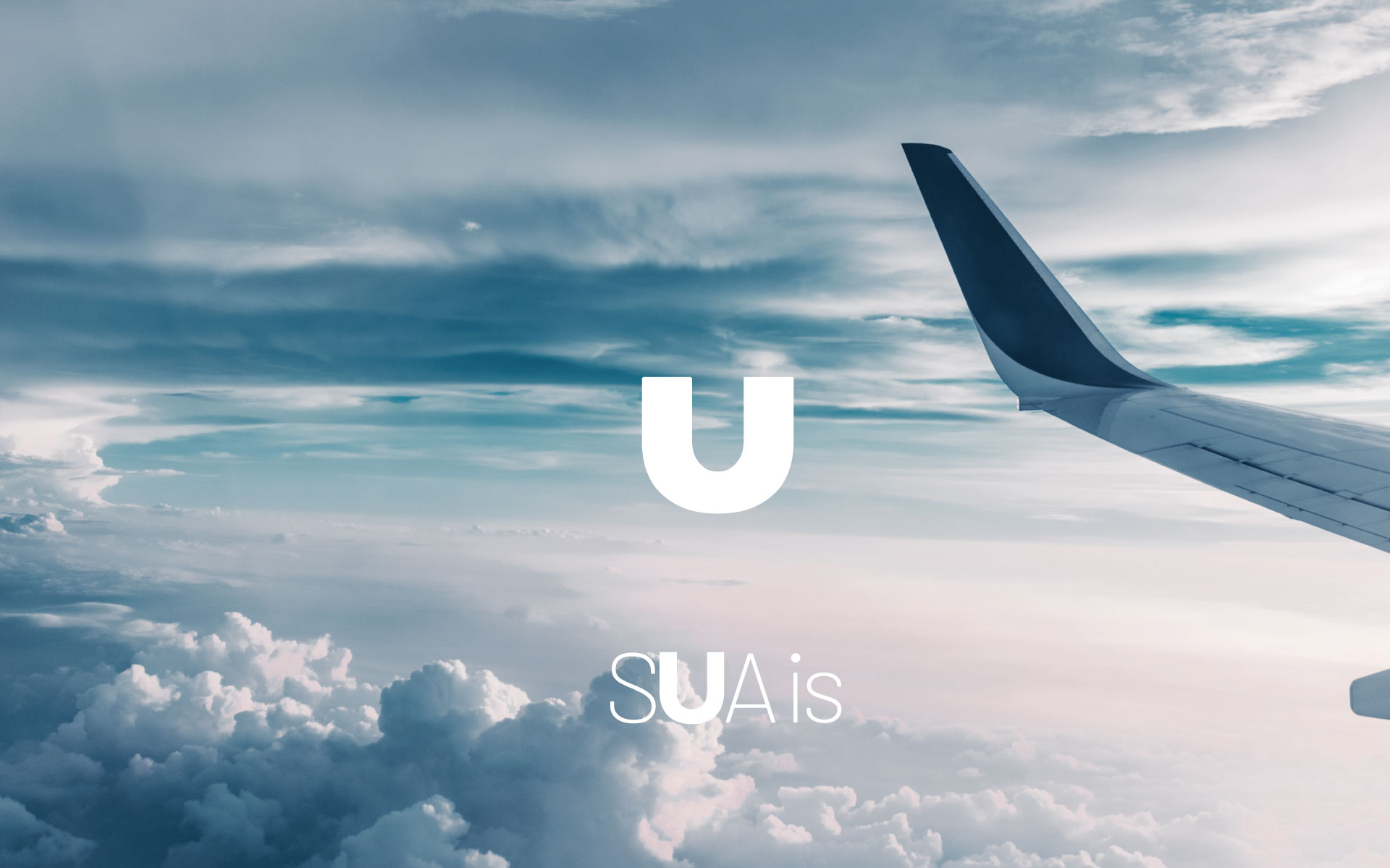
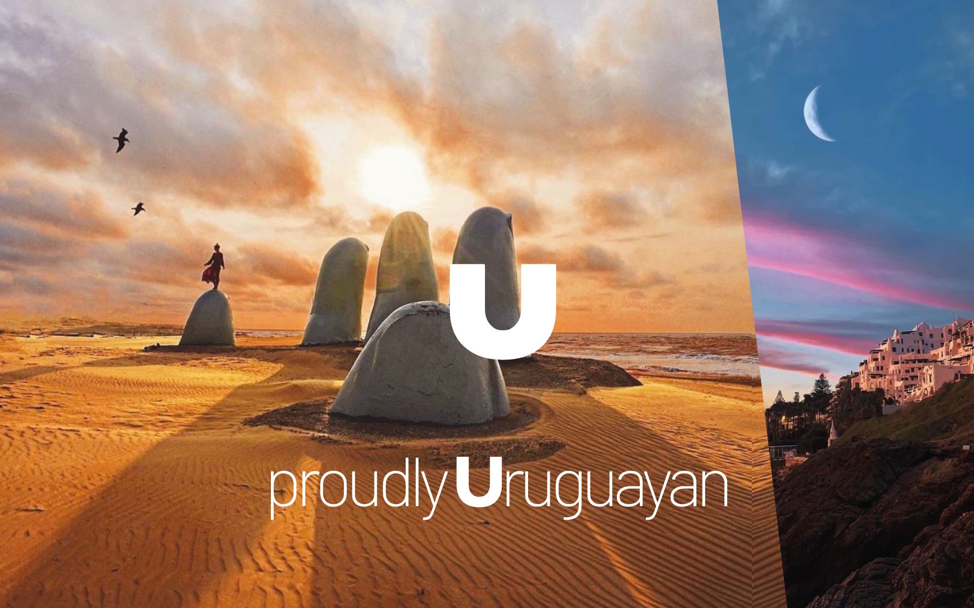
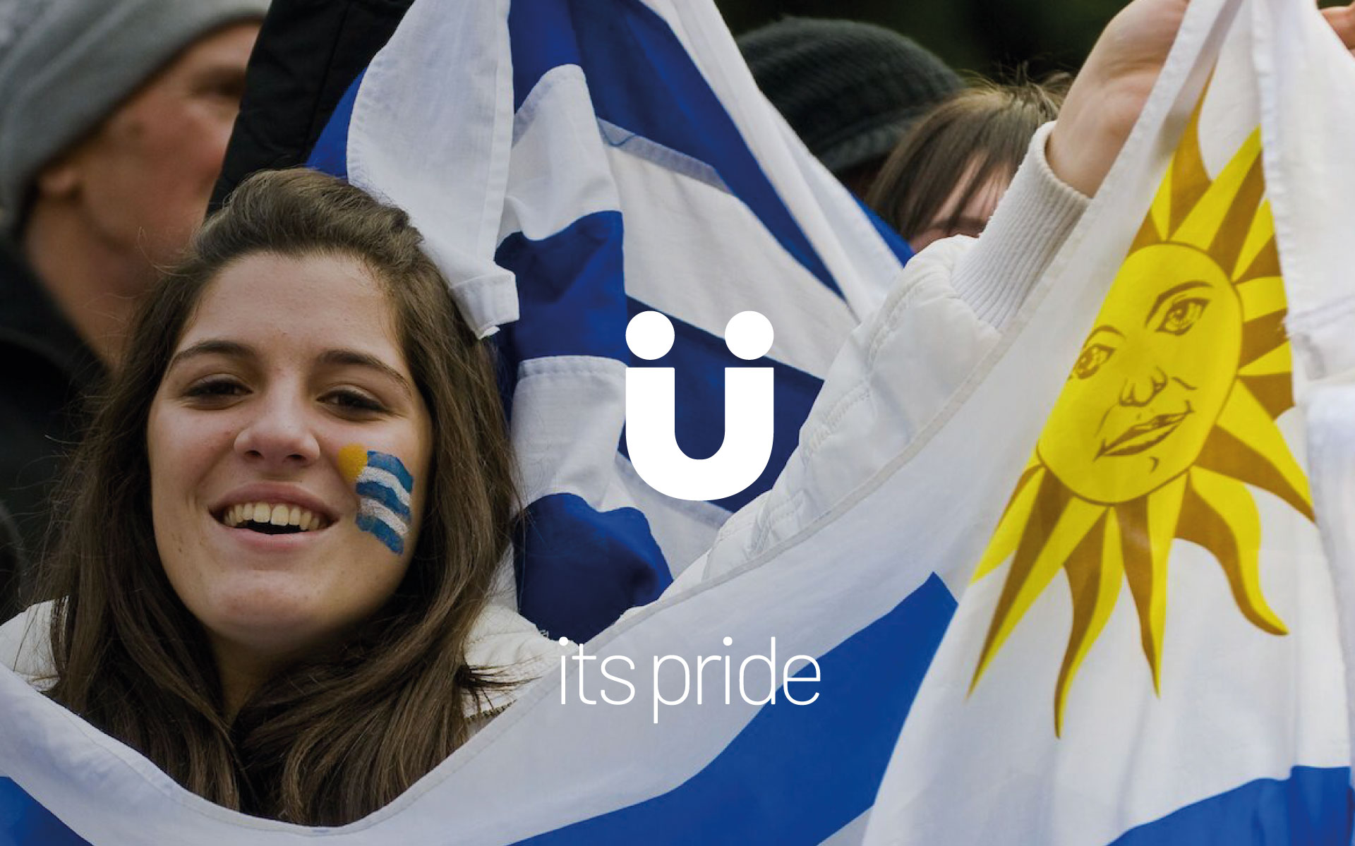
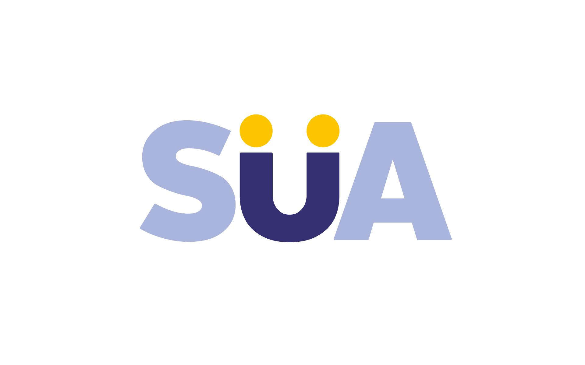
SUA, Uruguay
Branding SUA – The Spirit of Uruguay
The Challenge
The creation of SUA, Uruguay’s new airline, required building a brand identity that was authentic, memorable, and distinct in a competitive aviation market.
- SUA needed to reflect Uruguay’s national pride, warmth, and cultural richness while delivering an exceptional passenger experience. The challenge extended beyond creating a logo and messaging; it involved crafting a consistent, scalable, and cohesive brand that could grow from the Latin American market to a global audience.

What We Did
We began by immersing ourselves in Uruguay’s culture to create a brand that genuinely represented its people and spirit.
- Drawing on insights from extensive research, we developed a holistic brand ecosystem that included a visual identity, messaging, and customer experience design. The project extended beyond aesthetics, embedding the values of personalization, sustainability, and innovation into every aspect of the brand.

Strategy
The brand strategy focused on redefining expectations for air travel by blending modernity with warmth. SUA was positioned as a gateway to extraordinary journeys, where passengers could connect with new destinations and experiences.
- This vision was anchored by four pillars: authenticity, differentiation, personalization, and sustainability. SUA would stand out not as just another airline but as a symbol of Uruguayan pride, offering unparalleled service and a deep commitment to environmental responsibility.
Strategy
SUA is poised for success in the competitive aviation market by offering a unique combination of faster flight times, strategic connectivity, advanced fleet efficiency, exceptional service, and competitive pricing.
- Its focus on redefining the travel experience is rooted in customer satisfaction through superior service quality. From personalized inflight experiences to seamless support at every touchpoint, SUA is committed to exceeding passenger expectations. As the airline boldly declares: “We will redefine the travel experience one passenger at a time.”
Solution
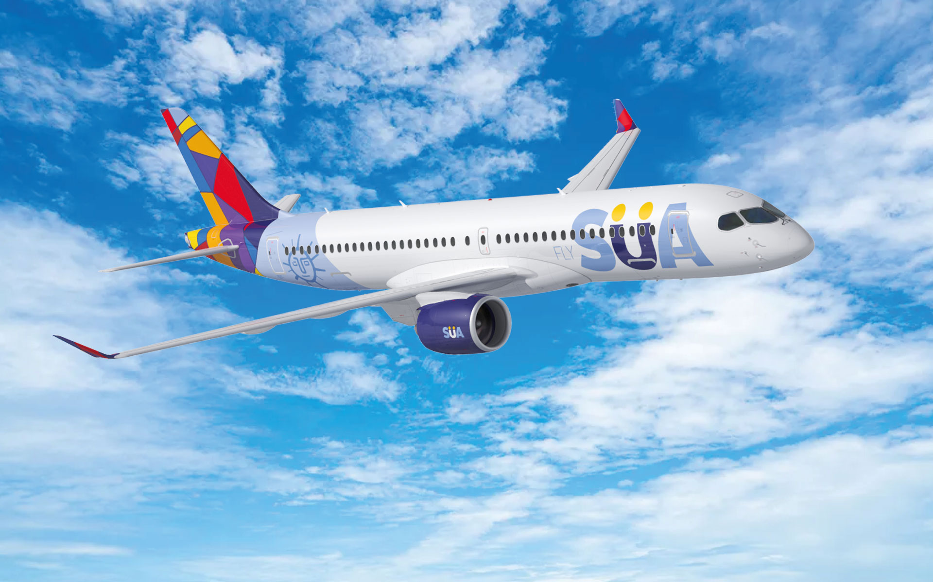
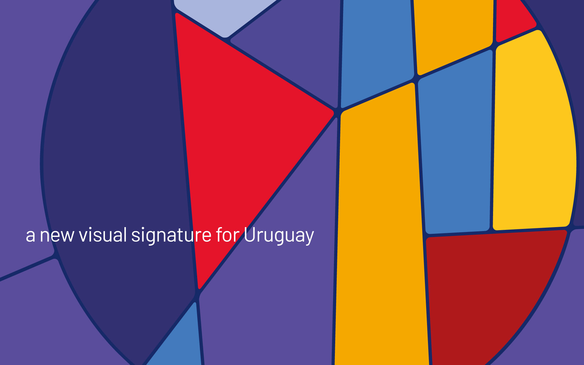
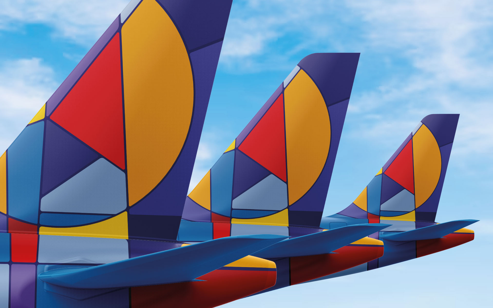
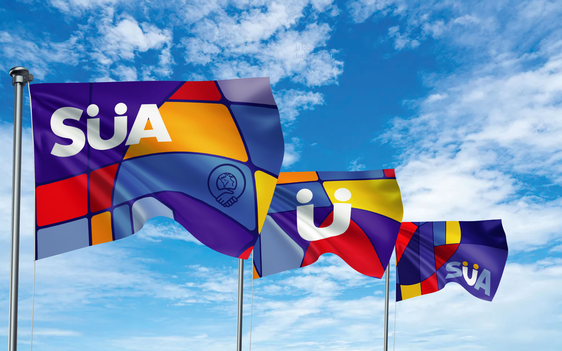
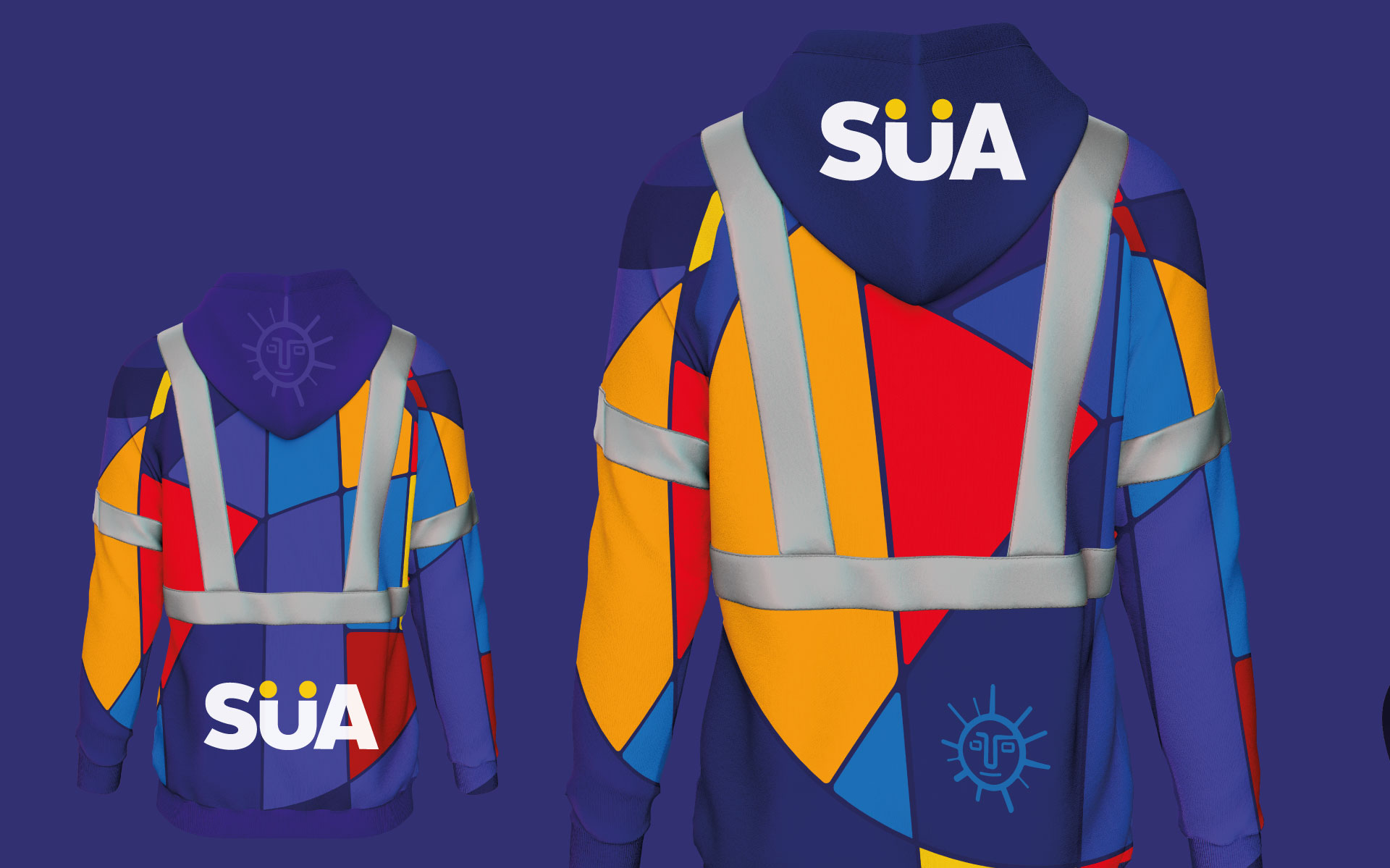
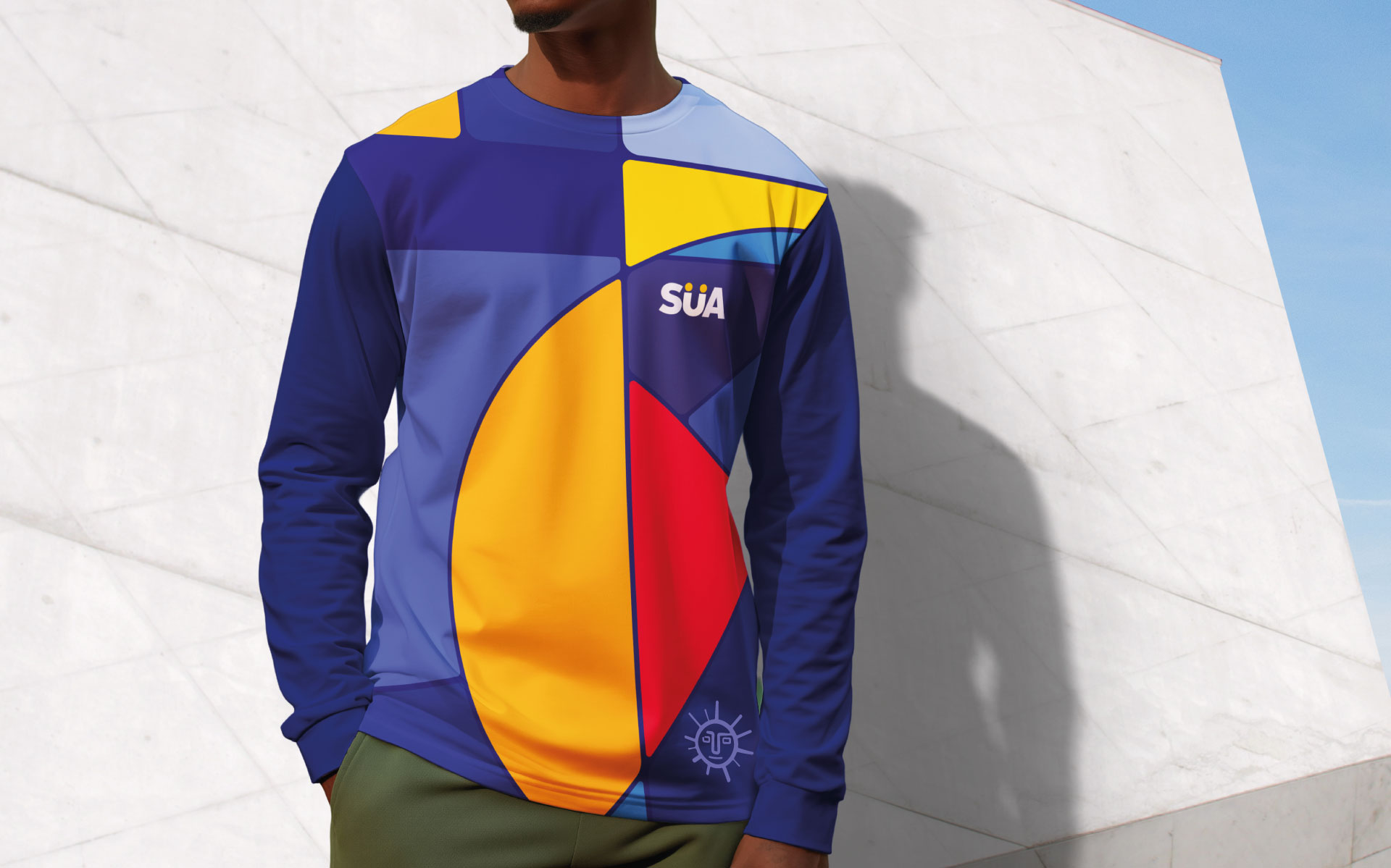
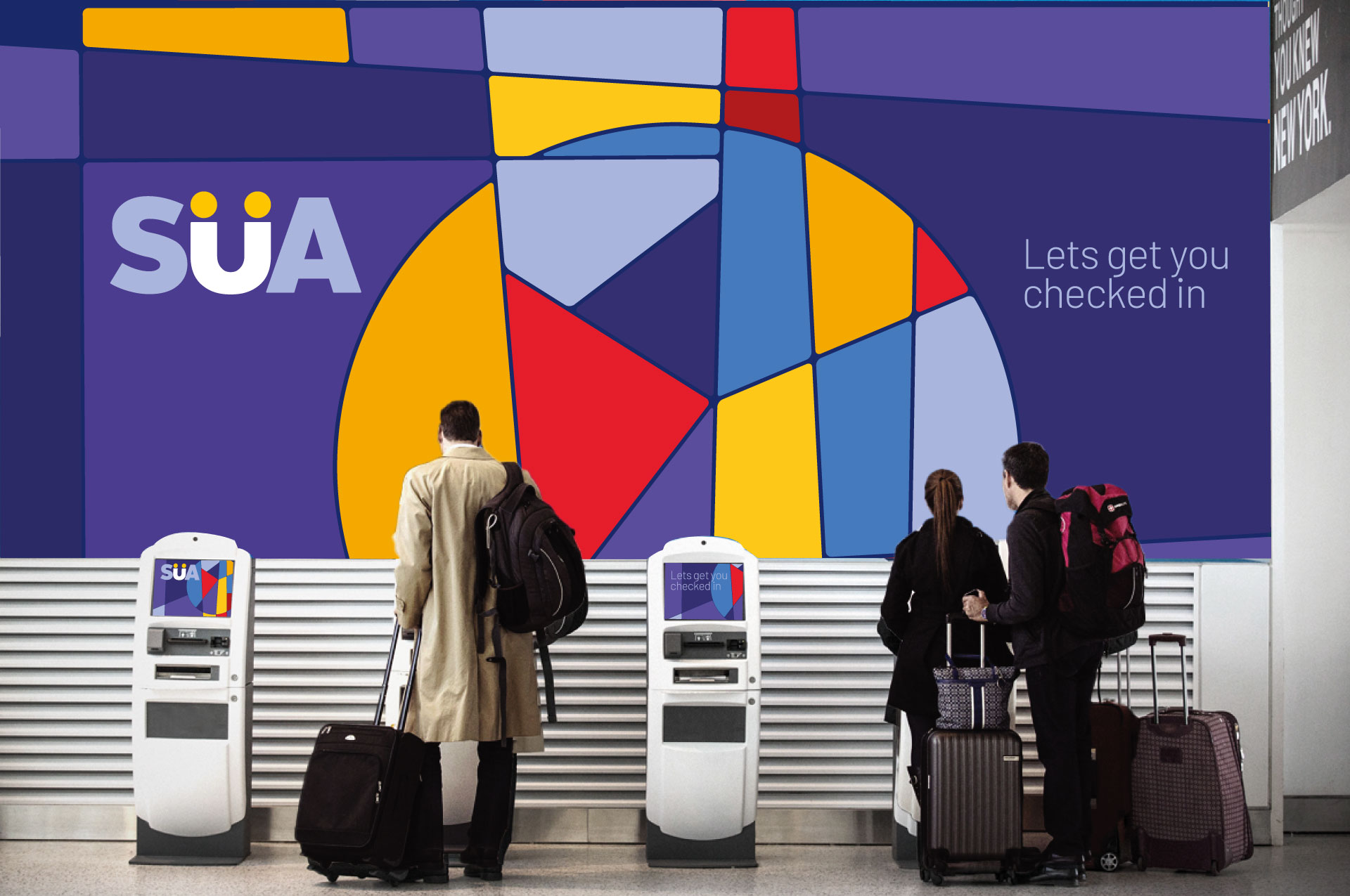
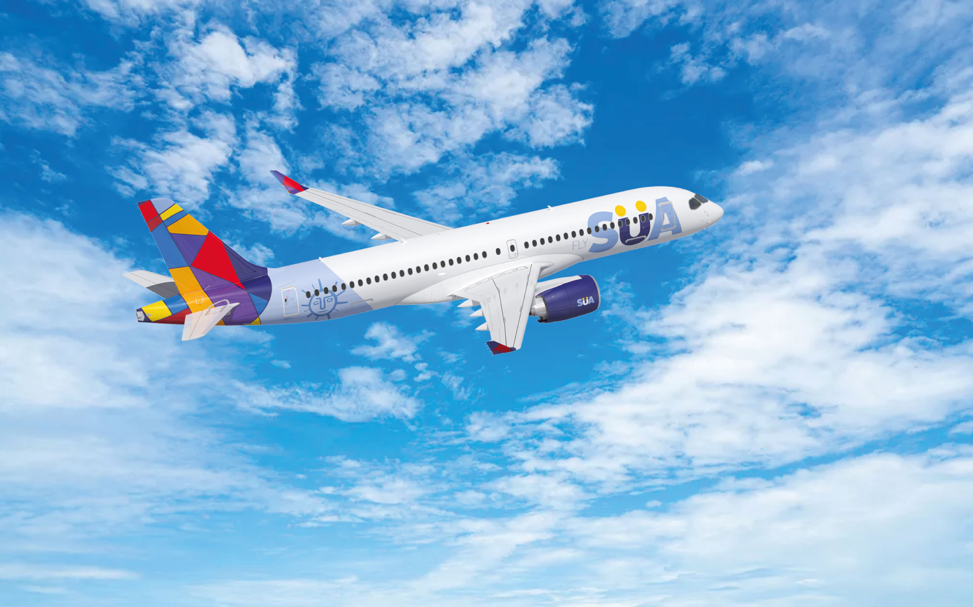
The brand’s visual identity was deeply inspired by constructivism, a movement that harmonizes geometric abstraction with cultural and social storytelling. This approach was particularly fitting for Uruguay’s narrative, where artistry and heritage intersect with modern innovation.
-
Drawing from constructivism’s principles, SUA’s identity was imbued with geometric precision and cultural depth. Abstract patterns and grid-like compositions symbolized connection and exploration, mirroring the airline’s mission to unite travelers with new destinations and cultures. This visual framework was paired with a modern color palette that evoked Uruguay’s natural beauty—the azure skies, golden sunsets, and lush greens.
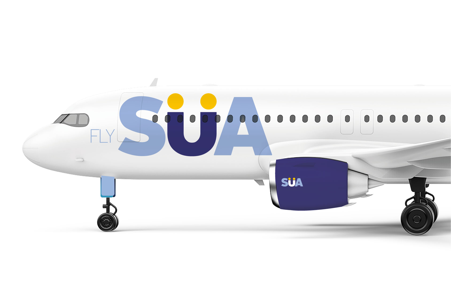
At the heart of SUA’s identity is its smile logotype, a dynamic representation of Uruguayan pride and personality. The smile symbolizes warmth, optimism, and the welcoming nature of the Uruguayan people. Its elegant curves subtly echo constructivist artistry, while its simplicity reflects the airline’s commitment to delivering a seamless and joyful travel experience.
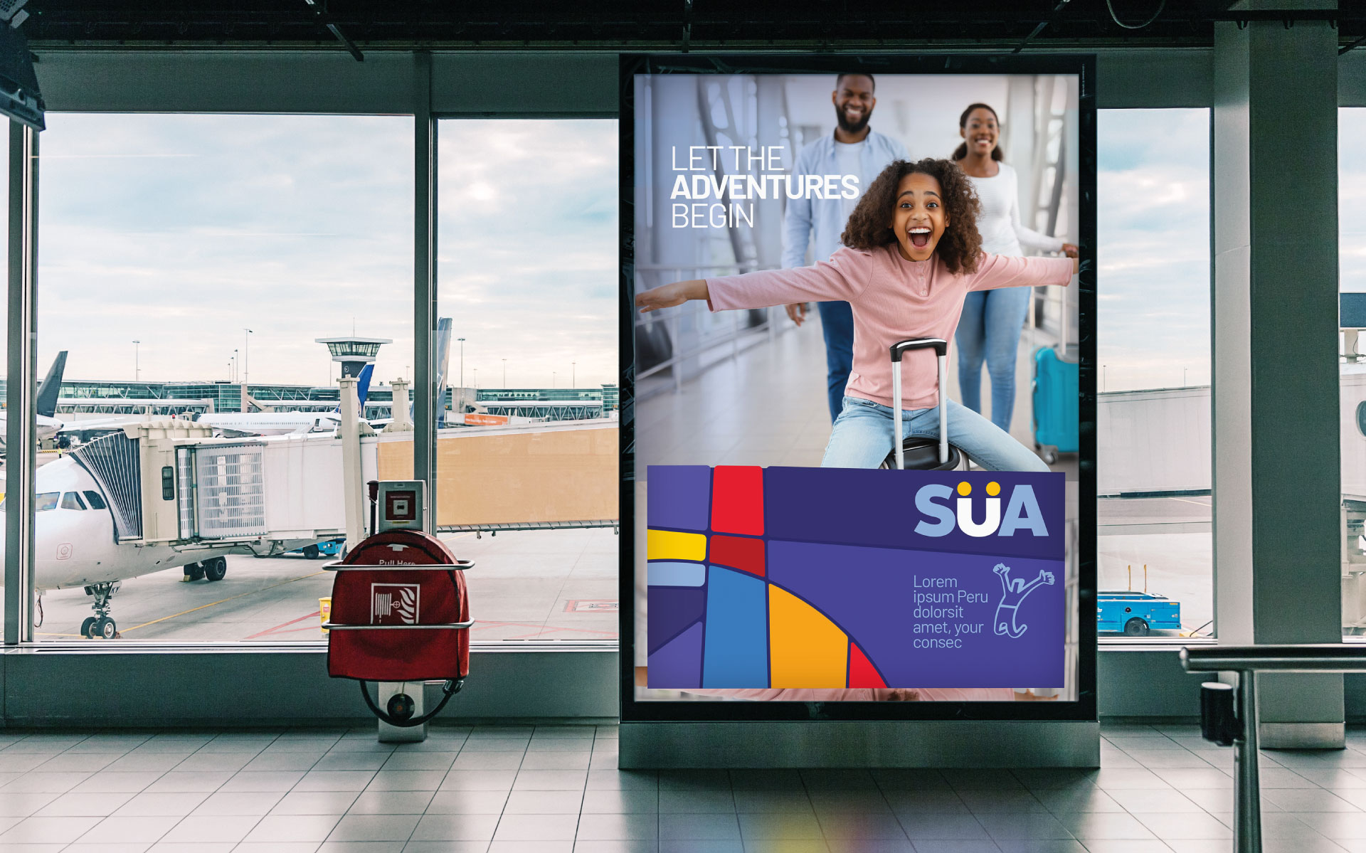
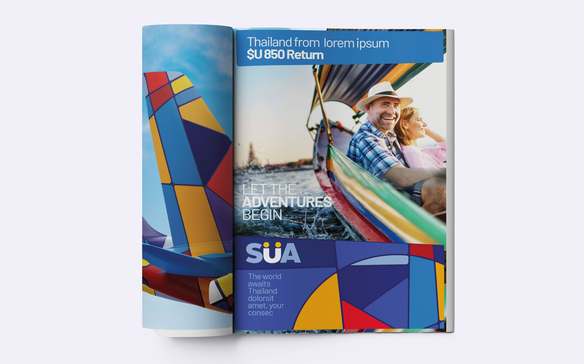
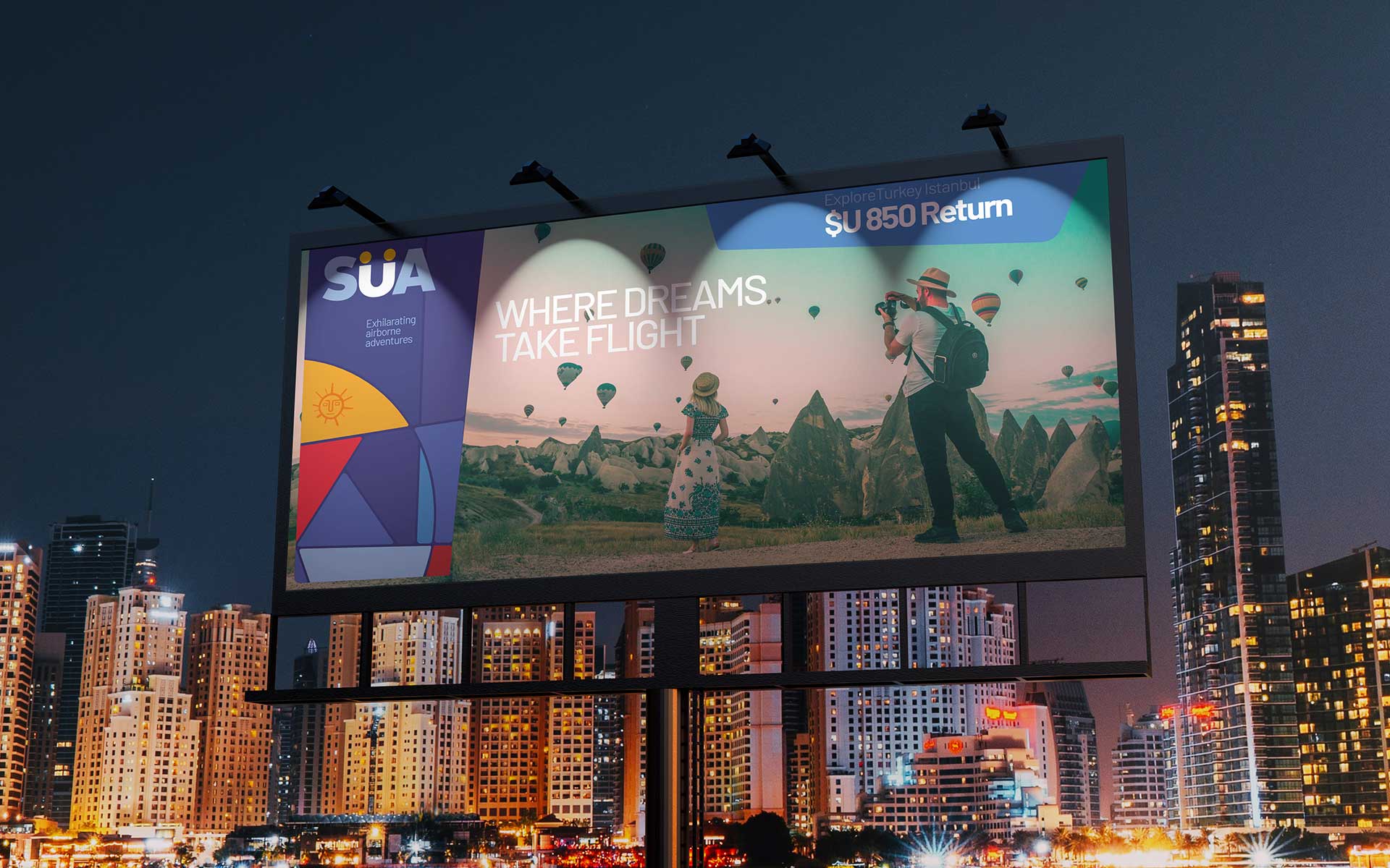
The messaging emphasized that traveling with SUA was more than a journey; it was a surprising odyssey and an exhilarating airborne adventure. From the moment of booking to the end of the journey, SUA’s brand experience prioritized comfort, punctuality, and personalized attention, inviting passengers to explore the world with the spirit of Uruguay.
The Result
SUA launched as a bold and innovative airline brand, with its unique visual identity receiving widespread recognition for its cultural depth and sophistication. By drawing inspiration from constructivism and the smile logotype’s representation of Uruguayan pride, SUA succeeded in crafting a brand that felt authentically Uruguayan while appealing to an international audience.
-
Passengers praised the seamless and personalized travel experience, while SUA’s focus on faster flight times, strategic connectivity, and advanced fleet efficiency set it apart in the competitive aviation market. The brand’s sustainability initiatives also resonated strongly with eco-conscious travelers. Within months of its launch, SUA established itself as a trusted and admired airline, setting a new benchmark for travel experiences in the region.
The cohesive brand system not only reinforced SUA’s values but also provided a strong foundation for its planned expansion to global markets, ensuring consistency and authenticity across every customer touchpoint.
SUA is more than an airline; it is an artistic tribute to Uruguay’s cultural heritage and a redefinition of the travel experience. Through its visual identity inspired by constructivism, the welcoming smile logotype, and its unwavering focus on passengers, SUA is poised to leave a lasting impact on the aviation industry while proudly representing the spirit of Uruguay on the global stage.
Antonio Rama (CEO of SUA)
"Working with TOTEM was one of the most rewarding things we've done with our team at SUA. Not only for the quality of their work, but for their humanity and ability to understand the scope and essence of what our brand wants to offer the market. It's amazing how they can interpret those values that are not tangible and difficult to explain in words or in writing, to come to the conclusion of what is really the image and the model and the way to connect with the public that best represents what our brand wants to give. We congratulate the team for choosing TOTEM because it has undoubtedly been one of the best things we have done to ensure the success of our company. It has been a pleasure to work with them."
Talk to us about your project: Send us an Email
or call us: +34 91 735 56 89
or call us: +34 91 735 56 89
© Copyright TOTEM 2026 - Legal Advice